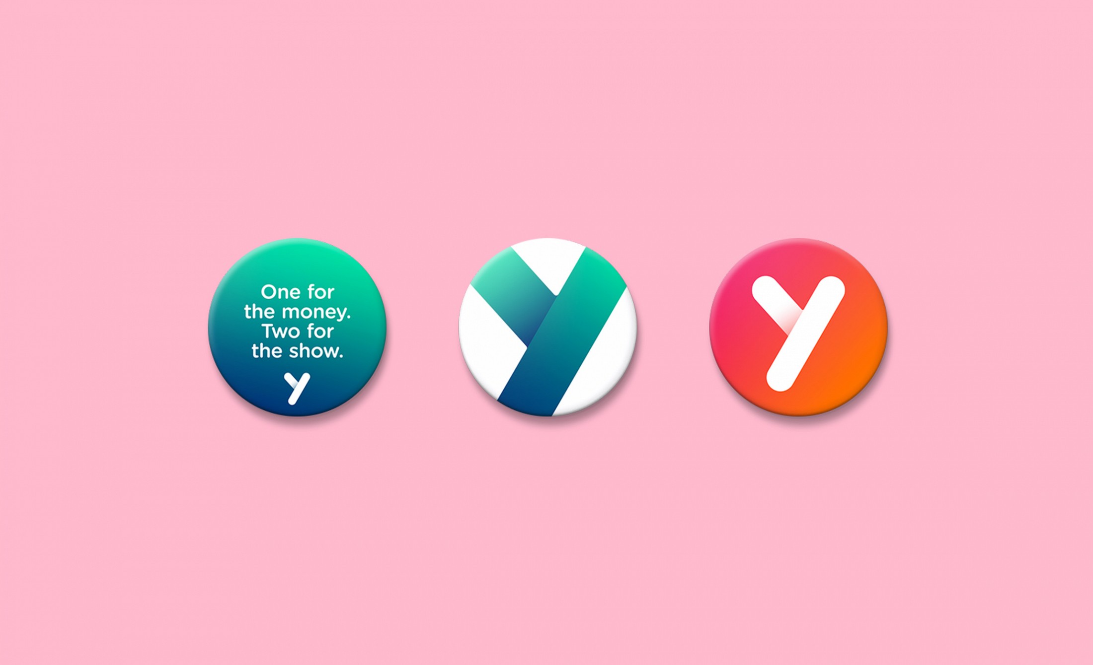
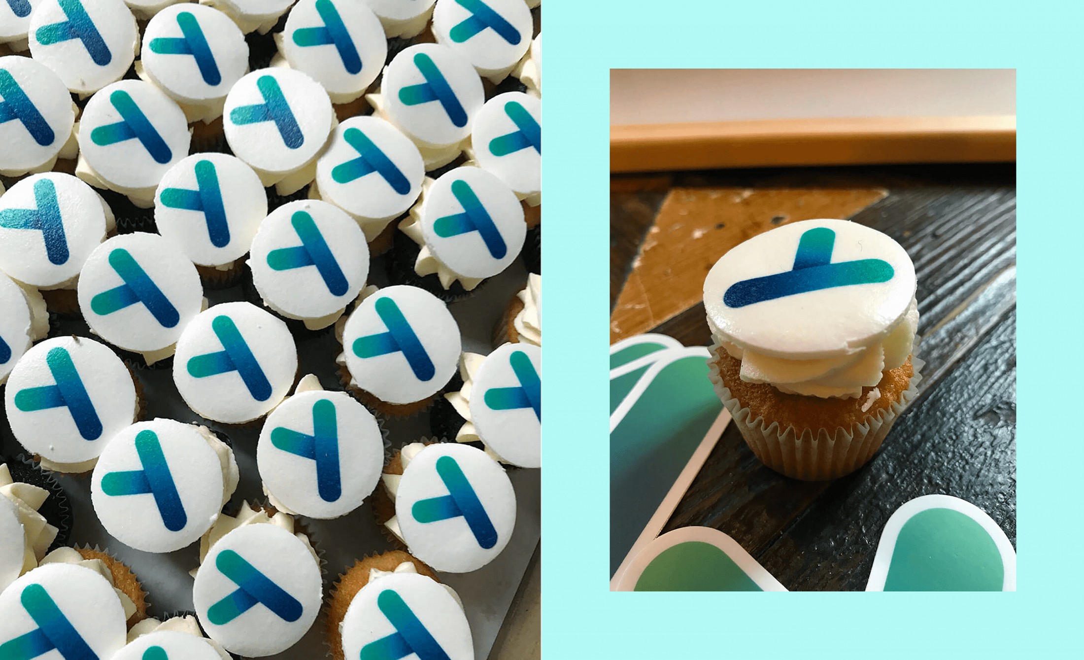
Yolt is a smart app that fully embraces the open banking model. The fintech company is owned by ING and combines all of a user’s finances, including bank accounts, savings accounts as well as credit cards onto one mobile platform. The launch of Yolt marks Dutch bank ING’s return to the UK market and accelerate its push as a leading European innovator serving more than 36 million customers in more than 40 countries. To deliver a UK go-to-market strategy and branding, in 2017 Yolt appointed mobile-first agency Fetch (Dentsu) as their full creative media agency, and I was the Creative Lead responsible for everything concerning the art direction.
Year: 2017 — 2018
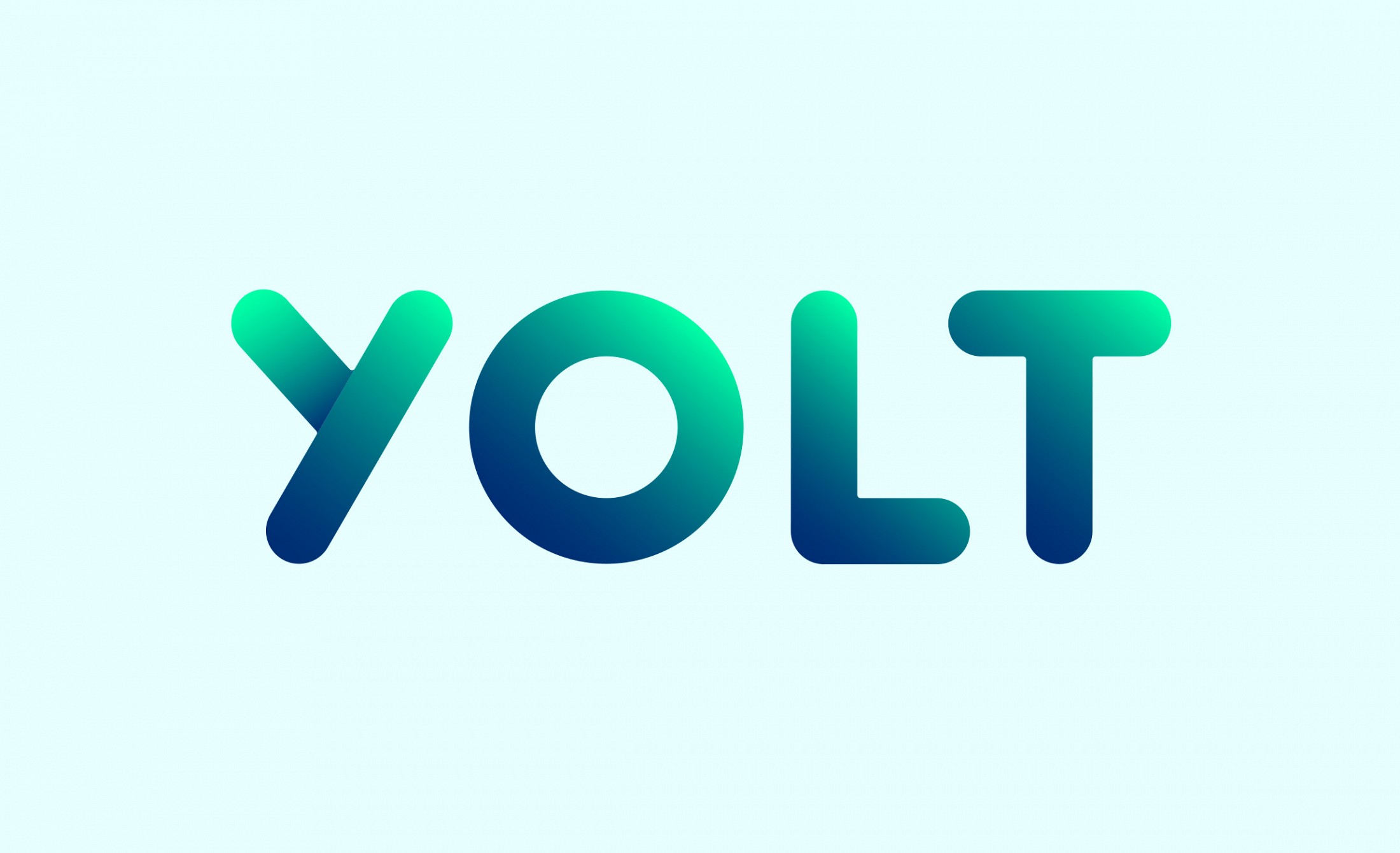
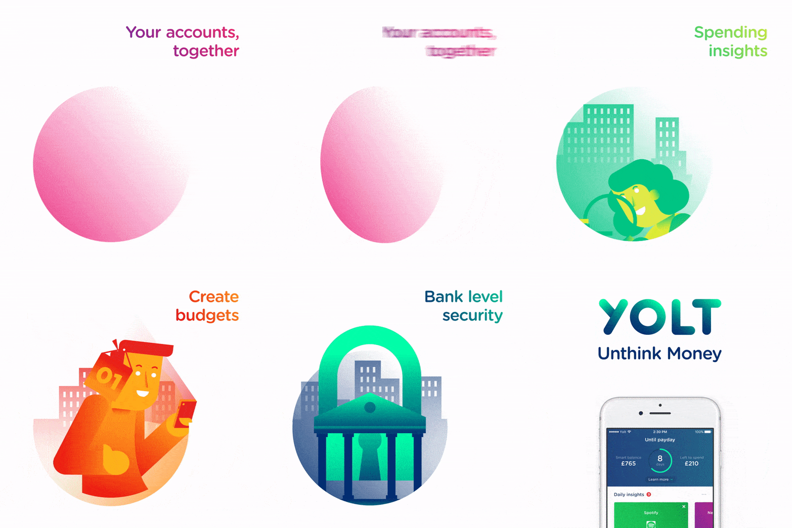
We needed to craft a digital-first, mobile-native brand identity to connect with our audience. We first crafted a brand strategy and manifesto that would underpin our brand vision. Followed by a visual design language that symbolised movement, action and energy. Brought to life through tone of voice, illustration, logo, photography, typography, colour across all digital channels from app, to website, to social media. We have redesigned Yolt’s visual brand identity prior to applying its mobile-first strategy to the campaign. Every element of the visual design was designed mobile-first to future proof the brand.
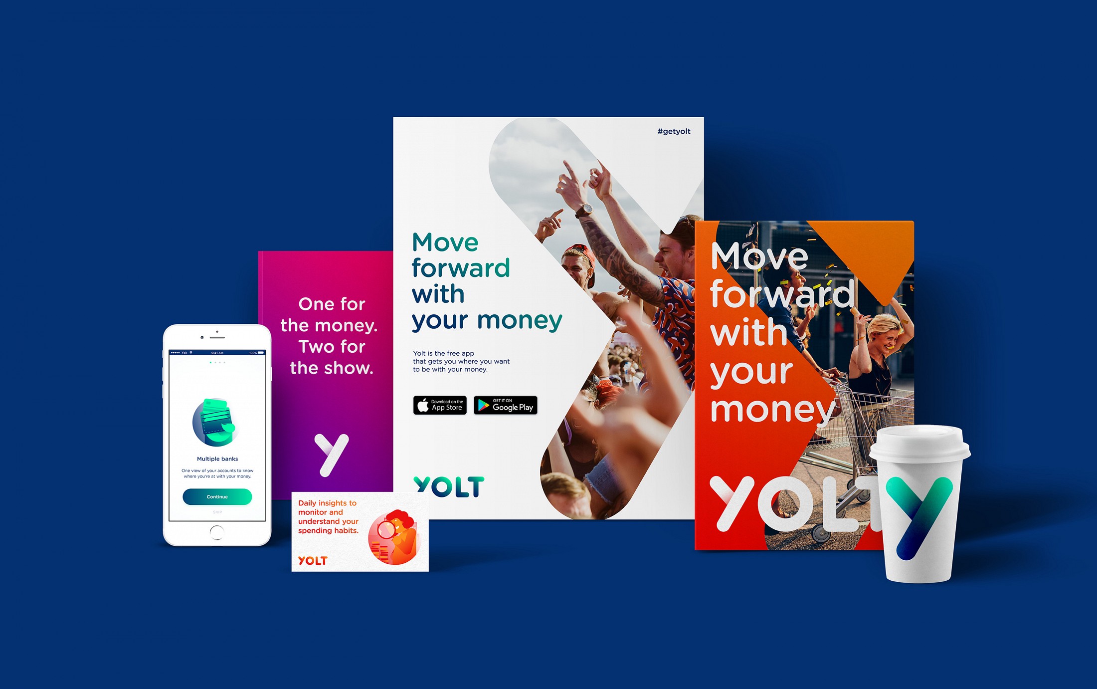
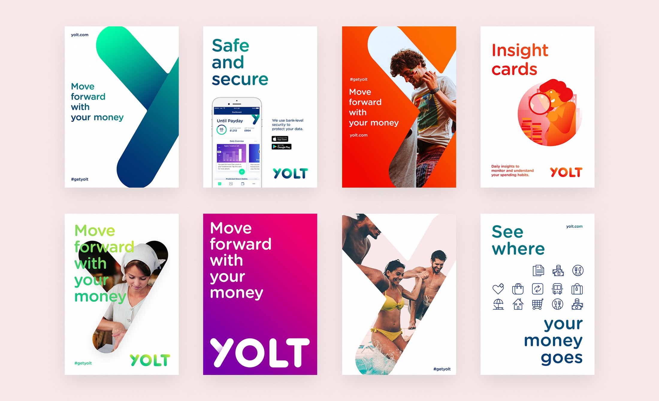
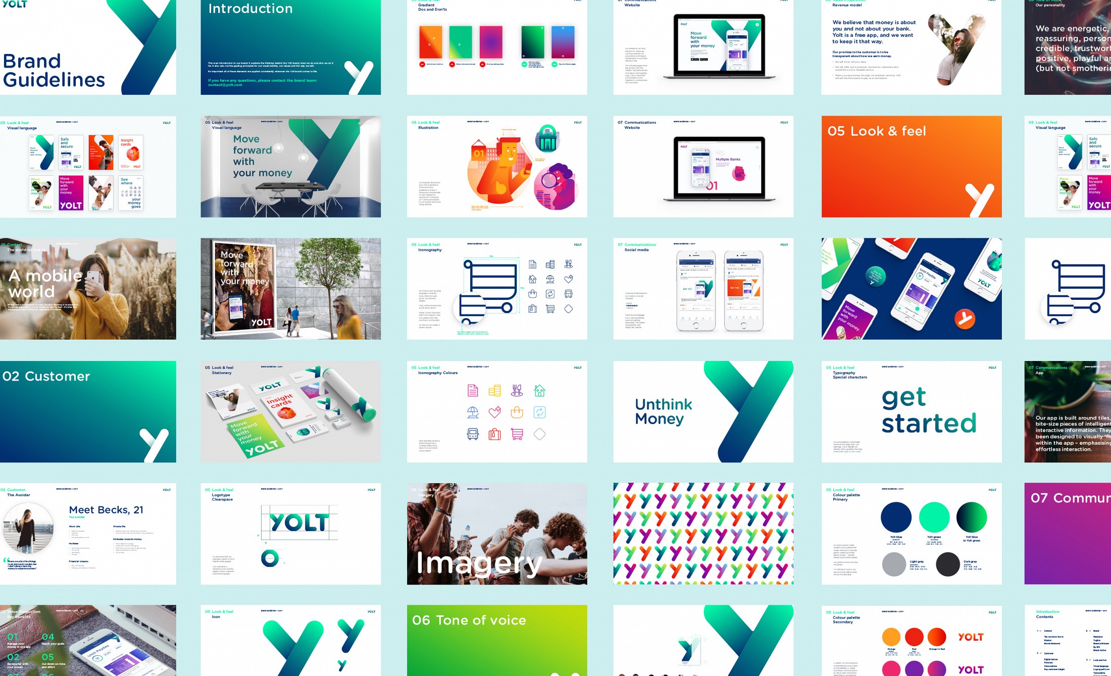
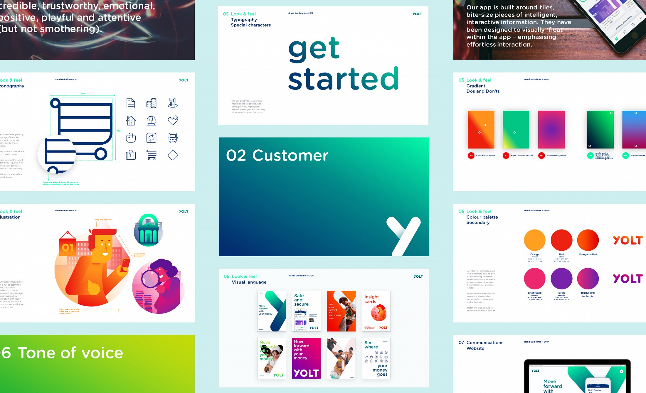
The new brand has also uplifted Yolt’s user experience. Working closely with the client, we’ve also designed the digital product to provide the same look and feel. The result is a unique and recognisable brand which connects a young audience with smart money management, both offline and online.
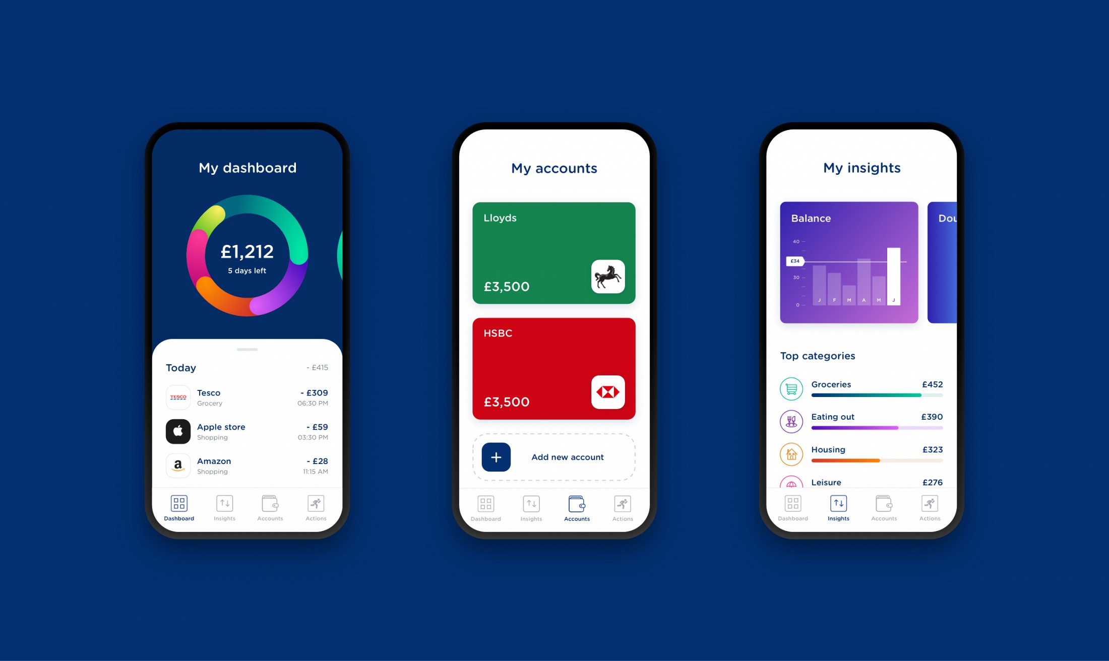
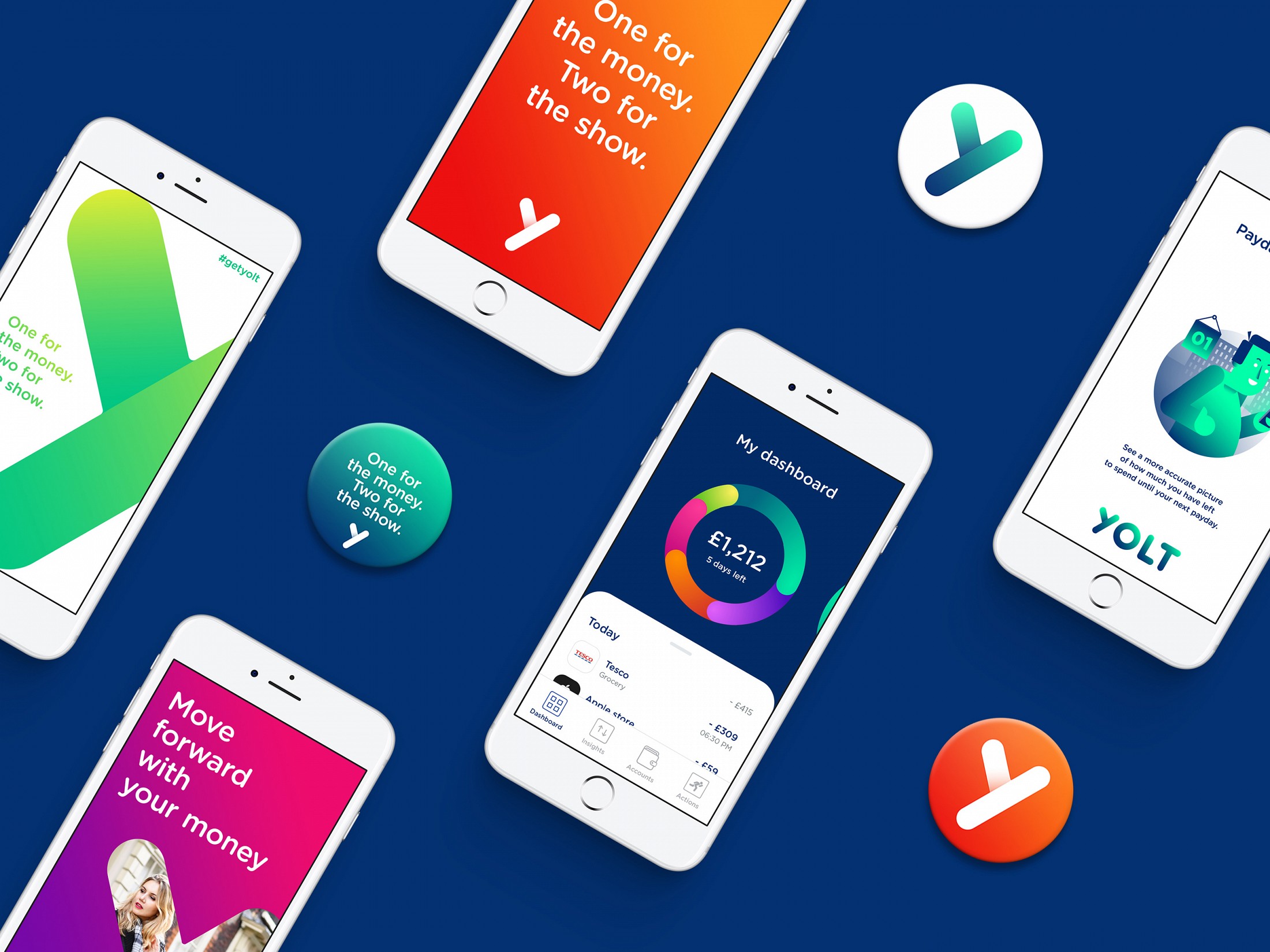
The app became Hot of the week in the App Store.
After we’ve set up the brand identity and designed the digital product, we have launched the service both online and offline with print, OOH, and video campaigns. The idea of the approved OOH campaign came asking myself simple questions like "how much did you spend on coffee last month?" or "how much did you spend on dates last year?". The answer was always that it’s hard to keep track, and that’s exactly what Yolt does. Using a range of characters with familiar spending habits, this concept nudges people to think about their outgoings within a particular category. A headline gets people thinking with humour, while the supporting line sets out Yolt’s key features. A bold visual of the app shows off its clear, intuitive tools.
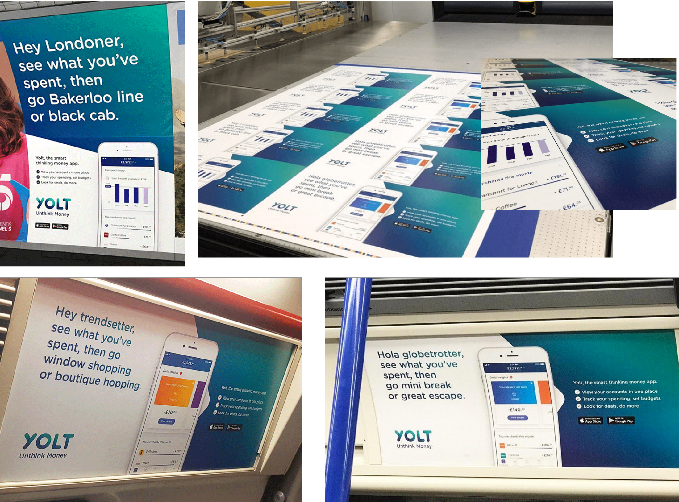
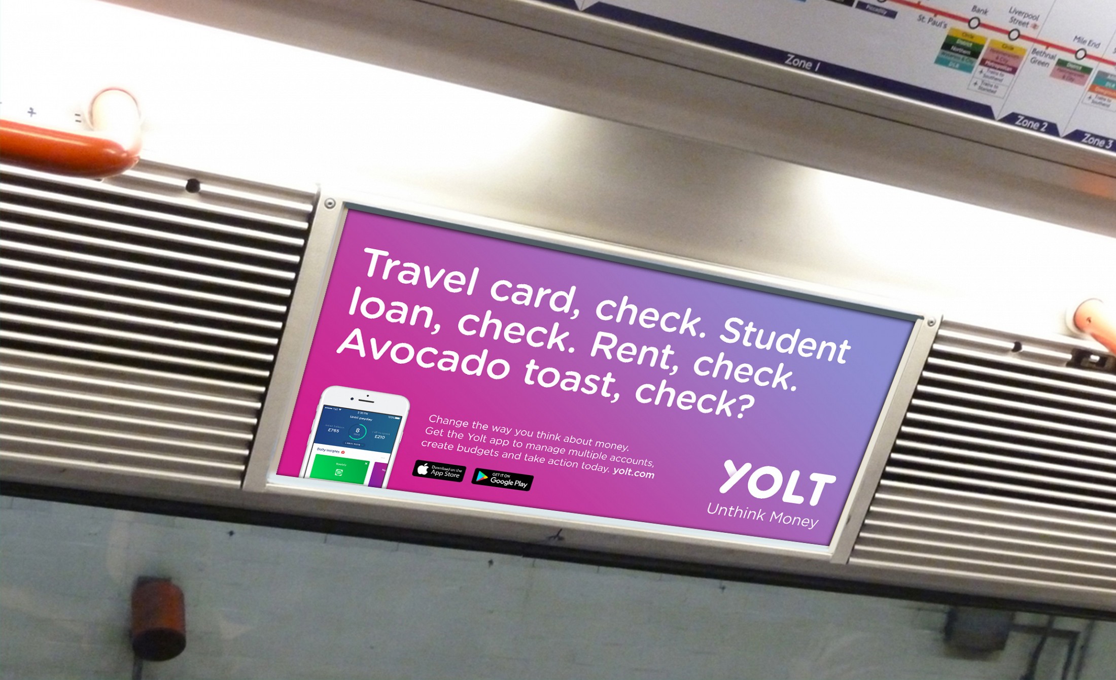

This wasn't the only concept that we presented to the client. I've worked closely with the strategic team to find solid insights based on analysis and data. We produced plenty of different layouts, ideas, executions. Here you'll find a few of them.
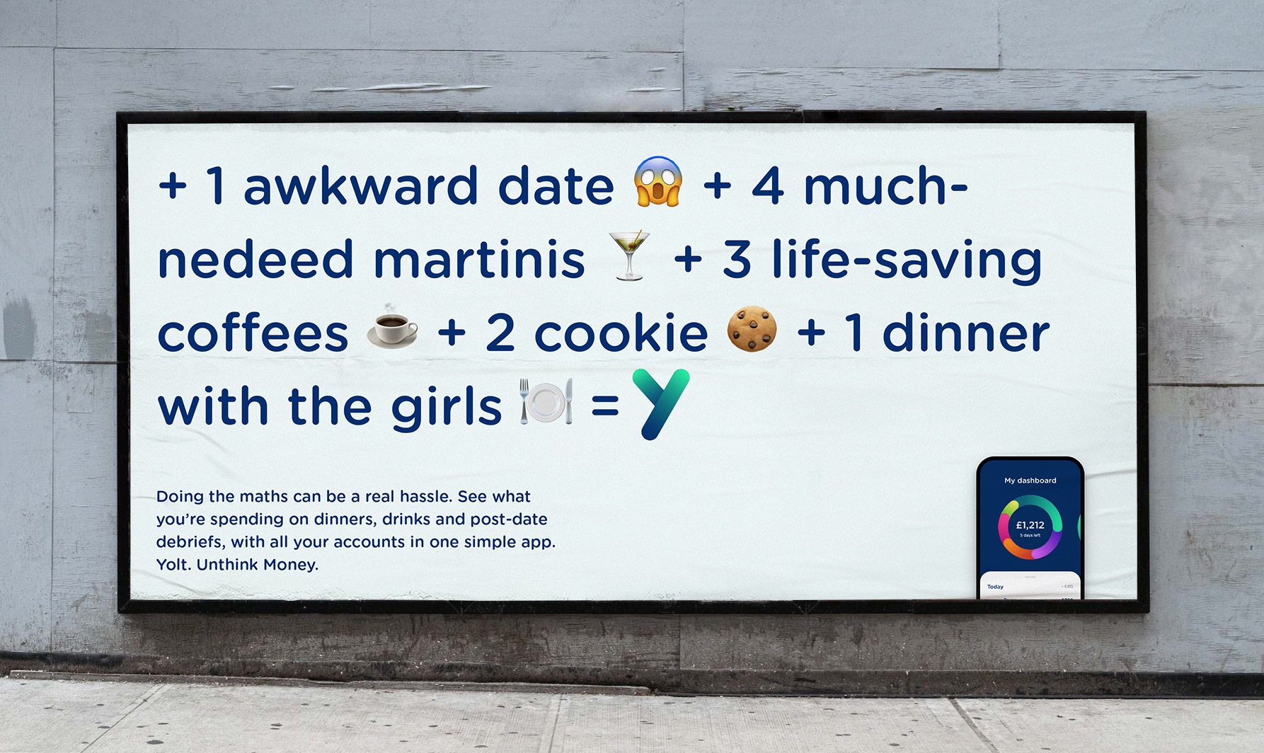
Impossible mathematic calculations. Doing the maths can be a real hassle. With Yolt, it's so easy to keep track of your spendings.
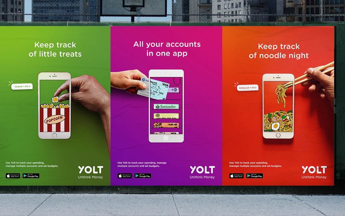
Another option, more illustrative, focused on the fact that you can keep track of your spending directly from the app.

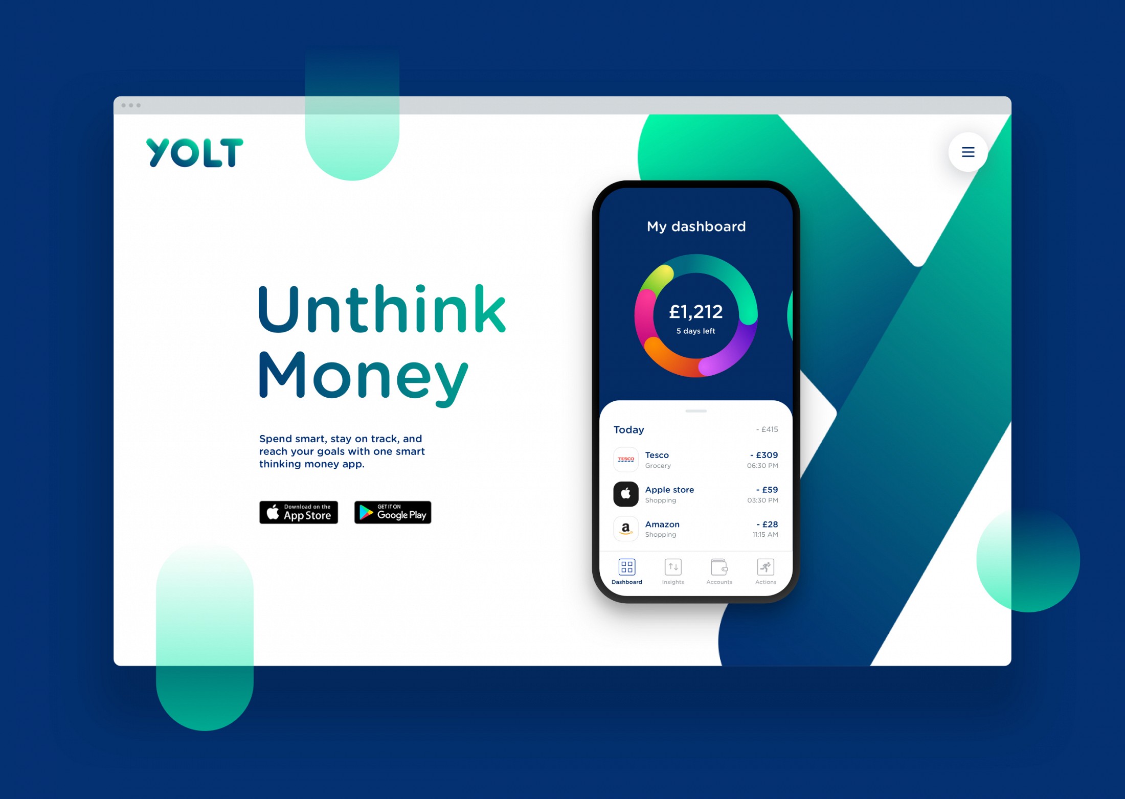
I'm proud of the work that I've done for Yolt: I was the art director, but I did more than just art direction. For instance, I came up with the tagline "Unthink Money". The idea of "Unthink Money" came up from a simple and true insight: Yolt is so easy to use that you just need to click on the app to have a look at all your spendings in one glance so you don't need to worry too much about money and you can enjoy the things you like most instead.
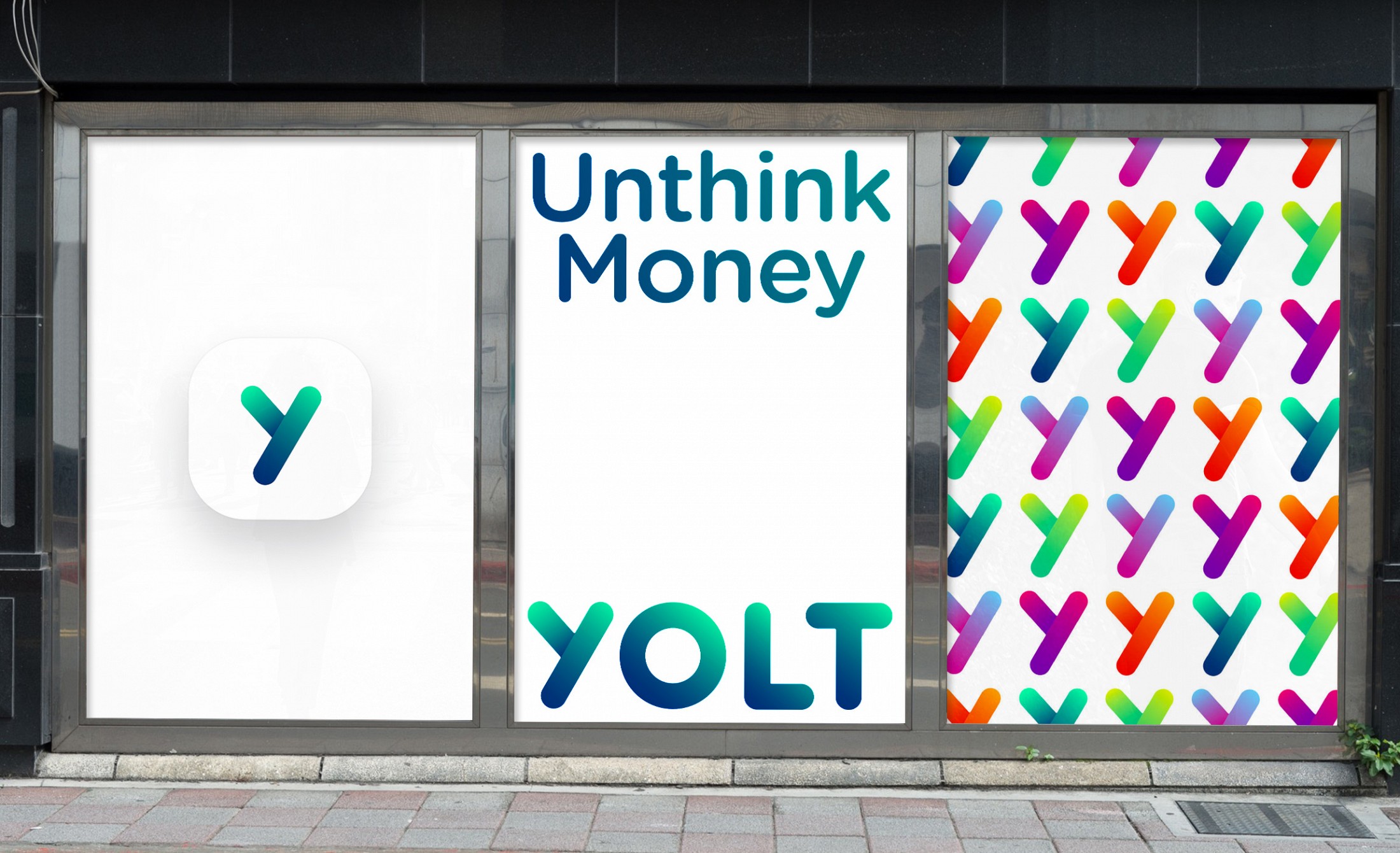
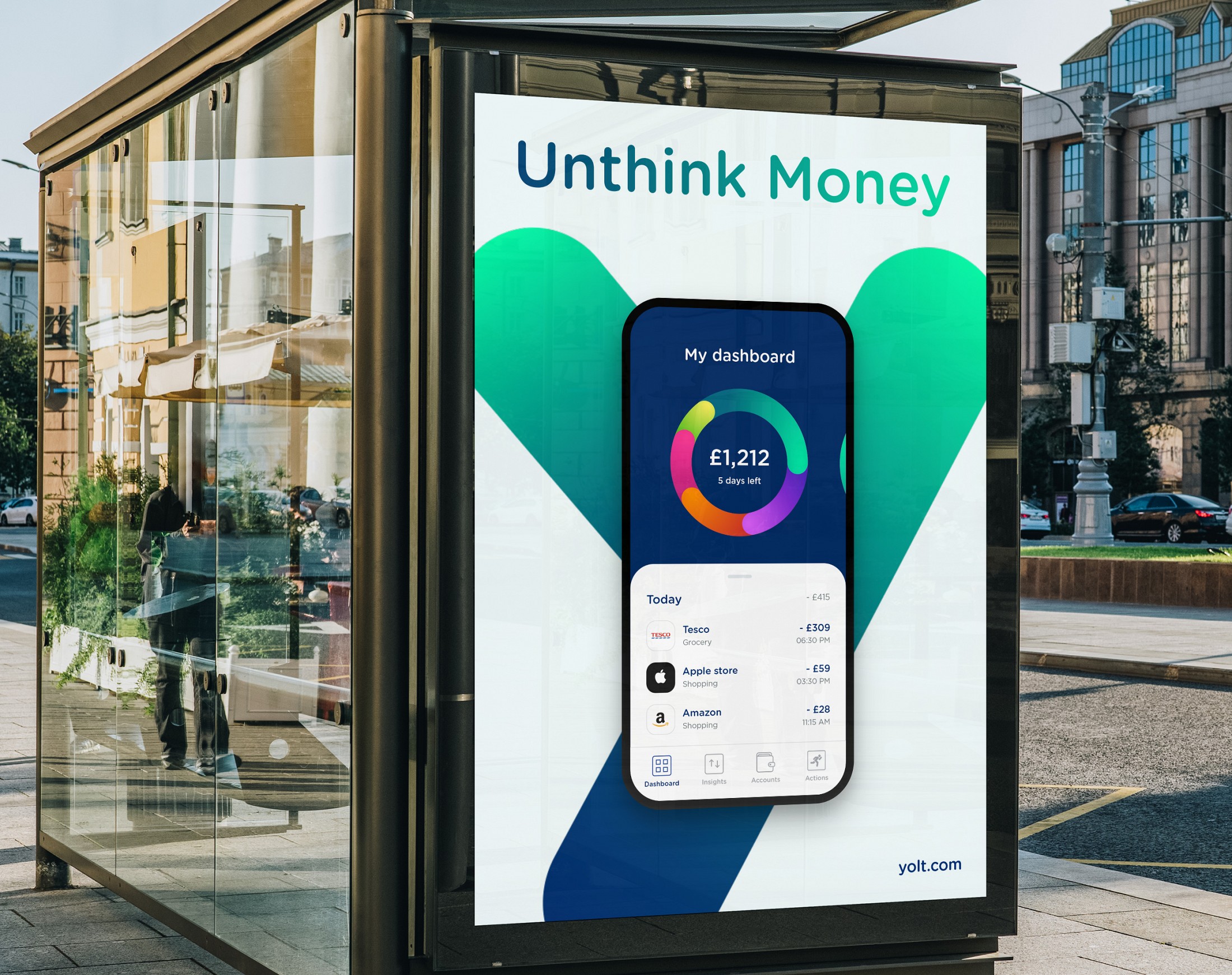
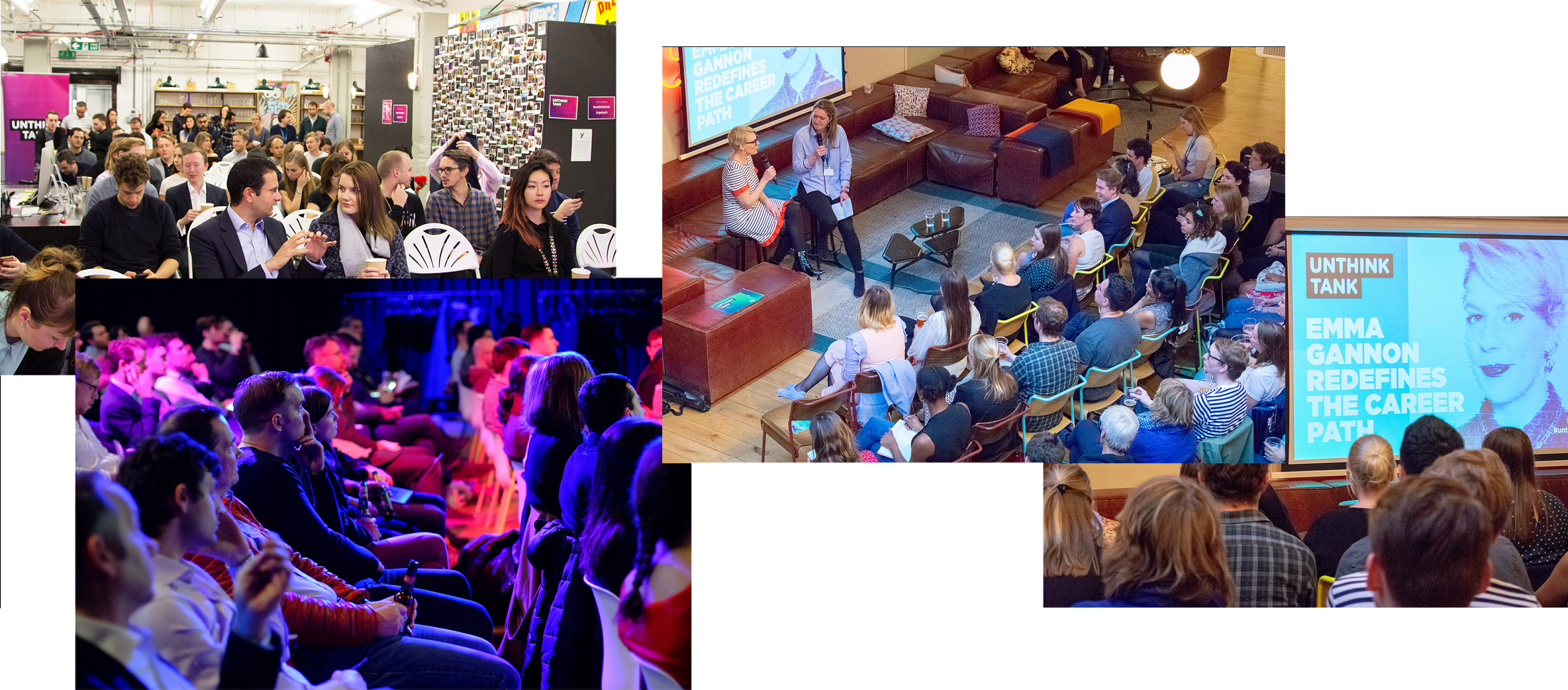
"Unthink Money" has been used everywhere: branding, website, app, and even events. I had the initial idea of creating a talk series inviting leaders and innovators from the industry. The client saw so much potential in this tagline and decided to extend the tagline even for those events with "Unthink Tank".
In 18 months, 500,000 users were attracted to Yolt’s fresh and innovative offering. ING, the biggest Dutch bank is returning to the UK after 5 years with a major success and an untapped new audience. Yolt is now shaping the way banks target millennials offering them a fresh, lively brand for mobile-first consumers who want to manage their money in an easy, smart and enjoyable way.
